
Inside boardrooms and Slack channels across industries, a familiar pressure looms over product and design teams: move faster. Deliver by Friday. Cut the research. Skip the testing. Launch and learn.
This pressure—while often driven by good intentions like innovation, agility, and market competitiveness—creates a dangerous mindset: that speed equals progress. That the faster we build, the more successful we’ll be. That good design is quick design.
But in reality? That mindset leads to burned-out teams, broken user experiences, and wasted work.
Because great UX isn’t a microwaveable meal. It’s more like a slow-cooked dish. If you rush it, you burn it.
Design Is Not a Race. It’s a Recipe.
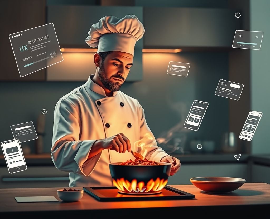
Think of a chef. Not a line cook at a fast-food joint, but a true craftsperson. Every step they take—selecting ingredients, prepping, tasting, adjusting—is deliberate. Not rushed. Not improvised. They don’t throw things into a pot and hope for the best. They follow a rhythm. A process.
UX design follows that same rhythm.
When we begin a project, our instinct might be to jump straight into solutions. But skipping essential steps in the UX process—like user research, journey mapping, usability testing—undermines the very purpose of design: to solve real problems for real people.
Just as rushing a meal ruins the flavor, rushing a digital experience ruins its usability.
The Mise en Place: User Research as the First Ingredient
In professional kitchens, chefs practice mise en place—a French term meaning “everything in its place.” Before a single flame is lit, ingredients are washed, chopped, sorted, and ready. It’s not just preparation. It’s orientation.
In UX, user research is our mise en place. It’s where we gather qualitative insights, observe behaviors, understand pain points, and identify needs. When this step is overlooked or rushed, we end up designing in the dark. We rely on assumptions rather than truths.
And assumptions are the fastest way to build something that looks good but fails in context.
Steve Portigal, a seasoned researcher, once said, “We need to move from designing for people to designing with people.” But we can’t co-create if we don’t first listen. Research gives us that entry point—and without it, everything else becomes guesswork.
Information Architecture: The Blueprint, Not the Afterthought
In the kitchen, recipes exist for a reason. They’re not just guides; they are systems. They give a dish structure—a beginning, middle, and end.
Likewise, information architecture (IA) gives users a map. It tells them where they are, what’s possible, and what’s next. IA is often underappreciated because it’s invisible when done right—but painfully obvious when done wrong.
Poor IA leads to confusion, frustration, and abandonment. Users can’t find what they’re looking for. Navigation feels like wandering through a maze instead of flowing down a path.
Yet, when teams are in a rush, IA is often cut short or left to developers to figure out. This is the equivalent of throwing random ingredients into a pot and hoping they taste good together.
A strong IA is a signal of care. It tells the user, “You’re in good hands. We thought this through.”
Interaction Design: The Flavor Profile of UX
A chef doesn’t just cook ingredients—they bring them together through technique. The heat, timing, texture. Stirring too fast breaks the sauce. Too much salt ruins the balance.
Interaction design is where UX comes to life. It’s the choreography between user and interface: how buttons behave, how feedback appears, how transitions feel. This is where the product starts to speak the user’s language.
But without time to experiment, prototype, and test these interactions, the experience becomes sterile—or worse, annoying. Users don’t tolerate clunky or unpredictable interactions. They abandon them. And often, they don’t tell you why. They just disappear.
Well-crafted interaction design, like a perfectly reduced sauce, takes practice and patience. It’s not something you slap on at the end.
Usability Testing: The Taste Test That Saves You
No professional chef sends out a dish without tasting it first. Why should UX be any different?
Usability testing is our taste test. It’s where assumptions get checked, designs get validated, and edge cases get discovered. And like in cooking, these tests don’t need to be complex to be useful. Even testing with five users can reveal major flaws.
But in the rush to ship, this step often gets downgraded to “nice to have.” The result? Products hit the market with issues that should’ve been caught early—and cost 10x more to fix later.
The irony? The more we test, the faster we can iterate. The better the experience, the fewer support tickets, complaints, or redesigns we’ll need.
Usability testing isn’t a delay. It’s insurance. It’s quality control. It’s respect—for the user and for the work.
What Happens When You Rush?
The cost of rushing UX isn’t just aesthetic. It’s existential.
We’ve seen it repeatedly: beautifully designed apps that flop. Websites that win awards but lose users. Features built with pride that no one understands.
When you skip steps, you erode trust. You create friction. You make your users do the heavy lifting.
And here’s the harsh truth: users don’t care how fast you launched. They care how well it works for them.
They won’t wait for you to fix it. They’ll switch, drop, or ignore your product entirely.
Because in their eyes, your brand is only as good as the experience you just gave them.
Design Teams Deserve Time, Not Just Deadlines
This isn’t a call for slowness—it’s a call for purposeful pacing. Agility is powerful, but it should never mean panic. True agility includes learning, reflection, and iteration—not just motion.
To protect the integrity of UX, organizations must resist the urge to measure success by delivery speed alone. Instead, we should measure by relevance, usability, and impact.
Design teams need air to breathe. Room to think. Freedom to test. Support to say, “Not yet. We’re not ready.” That’s not resistance. That’s responsibility.
Slow UX Is Smart UX
The next time you’re facing a decision—ship now, or wait until it’s truly ready—remember the kitchen.
Remember that good food takes time. That cutting corners changes outcomes. That people don’t come back for speed. They come back for taste.
And just like food, experiences that resonate—ones that leave people satisfied, delighted, and loyal—are crafted, not rushed.
Because in UX, just like in cooking: If you rush it, you burn it.
Your Turn: Have you seen a rushed design backfire? Or been part of a team that took its time and nailed the experience? I’d love to hear your story. How do you balance speed with depth in your UX practice?