
The Power of the Invisible
There is a quiet power in the small moments, the overlooked details that shape our digital journeys more than we realize. In the world of user experience, these moments often happen between the clicks. Not in grand redesigns or flashy interfaces, but in the frictionless flow of a user simply understanding what to do next.
Amazon, a company known for its obsession with customer satisfaction, once faced a silent problem that most businesses would have missed. They were not losing customers to a better competitor. They were not suffering from a technical glitch. They were losing millions because of a single word in their checkout flow.
The Problem: When Language Blocks Conversion
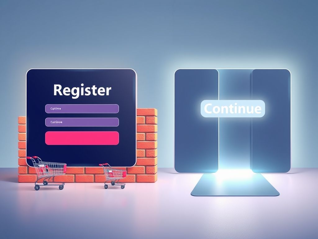
At the time, Amazon’s purchase journey followed what many considered standard practice. After adding products to their cart, users were met with two options: “Login” or “Register.” Straightforward. Logical. Conventional. But hidden in this moment was a UX misstep, subtle yet costly.
The User’s Mindset
The word “Register” triggered an unexpected reaction. For new visitors, it signaled bureaucracy and obligation. It felt like a commitment, an extra task. For returning users, especially those with multiple or forgotten accounts, it created anxiety and friction. Password errors, login loops, and redundant email warnings created a bottleneck that should not have existed.
Here lies the beauty of UX. The biggest problems often stem from the smallest assumptions.
The Fix: One Word, One Sentence
To Amazon’s credit, they did not just try to optimize the flow. They empathized. They stepped into the user’s shoes and invited UX expert Jared Spool to rethink the approach.
His solution was startlingly simple. Replace the word “Register” with “Continue” and add a short, comforting message:
“You do not need to create an account to make purchases on our site. Simply click Continue to proceed to checkout. To make your future purchases even faster, you can create an account during checkout.”
No new features. No new visual design. No unnecessary prompts. Just a clearer path forward.
The Results: Quiet UX, Massive Business Impact
The effect was immediate and profound.
- In the first month, Amazon recovered 15 million dollars in revenue
- Within a year, the change generated over 300 million dollars in additional sales
- Cart abandonment rates dropped. Purchase completions surged
All of this came from a small adjustment in copy and a deeper understanding of the user’s mental model. It was not loud or revolutionary. It was simply correct.
Why It Worked: UX Is Human, Not Technical
Why did such a minor change move the needle so dramatically? Because UX is about behavior, not just interfaces.
The Psychology Behind the Click
When users shop, they are focused on the goal, buying. Any detour that does not feel essential, especially one that suggests extra effort, creates mental resistance. The word “Register” implied complexity. “Continue” suggested ease. That single shift reduced hesitation and preserved momentum.
This is the core of great UX. Reduce uncertainty, remove blockers, and speak in the user’s language.
The Takeaway: UX Is Strategy, Not Decoration
This story is more than a clever case study. It is a lesson in how UX should lead product thinking. Not as an afterthought or a coat of paint, but as a fundamental part of the business strategy.
How many digital products in the MENA region still force users to sign up before exploring? How many fintech apps create password fatigue before trust is earned? How many portals use language designed for systems, not for humans?
The Amazon fix is not a one-off. It is a framework for identifying hidden friction points and addressing them with radical simplicity.
Local Reflection: What Is Our ‘Register’ Button?
In the Arab world, we are in the middle of a digital transformation. Adoption is high. Expectations are evolving. But UX maturity is still uneven. Many platforms still mirror Western design patterns or outdated logic without questioning their relevance to local behaviors.
At 7awi Media Group, we have spent years observing this. And time and again, we see the same truth emerge. Users do not leave because something is broken. They leave because it does not feel right.
So the real question every product team should ask is:
Where is our “Register” button?
That one word, one flow, one hesitation point that is quietly costing money, time, and trust.
The Next 300 Million Dollar UX Story
Amazon did not win this round by adding features or outspending competitors. They won by listening. They acted with humility. They trusted the user’s instinct over their own assumptions.
The UX community often chases the shiny and the new, AI, personalization, gamification. But the heart of great UX is still about understanding people better than they understand your product.
Somewhere in your experience, there is a blocker that can be solved with clarity, not complexity. That is where your next breakthrough lives.
Let us not underestimate the power of one word. Because the next 300 million dollar UX story might just be yours.